The Great Wealth Transfer Is No Longer a Forecast. It’s Your New Retention Strategy.
April 28, 2026 | 3 min read

 Blog
BlogCopied
April 22, 2016|0 min read
Personal financial management (PFM) software has existed since the earliest days of the PC, and yet consumer adoption of the products has often been lackluster. Rick Claypoole, Director of Retail Product Management and Marketing at Cadence Bank, tells one reason for the low adoption. He says, “Looking back at early PFM solutions, the only consumers who would really use those tools were the hardcore budgeters... And, while the early solutions were pretty cool for those users who wanted to do a lot, they were not very user friendly. And, in reality, almost nobody wants to do a budget, so the potential market for the solution was limited. It’s a chore, it’s laborious, and it’s not fun.”
In addition to Rick’s points, there are a number of other reasons why traditional PFM hasn’t been effective. Namely, it has been:
By having PFM hidden in a tab, multiple rows down, very few users have been able to find it. And if users can’t find it, they can’t use it. Digital money management needs to be fully integrated into the user experience if financial institutions want to help truly enrich their account holders’ financial lives.
A major shortcoming of typical account aggregation services is that they only use a single data provider and rely heavily on screen scraping. This means that if the single connection to the data provider breaks or there is change in layout of the website, the account holder must wait days, weeks, or even months (depending on the data provider, the population of the connection, and the degree of work required) for an engineer to fix the connection.
Here’s what the typical process looks like:
To overcome these challenges, financial institutions need to have direct connections through a data exchange and use multi-source aggregation.
Anyone familiar with transaction feeds knows that the raw data isn’t pretty. The feeds typically consist of a messy string of random-looking characters as shown below:
COSTCxx 04ROCHESTER XXX726 XXX-XXX-1189 XXX027
What is an account holder supposed to do with that mess? In many cases, all they can do is dial in to the call center of that financial institution and ask what the feed is supposed to mean.
When users come to your site, they want data that’s insightful and understandable — with the least amount of effort required on their part. Ideally, the transaction feed shown above should be cleansed to its simplest and clearest form:
Costco
If you’ve ever used a standard PFM solution, you know the pain of poor categorization. When a transaction such as a dinner is categorized as ‘electronics’ as opposed to ‘food & dining,’ it kills the entire money management experience. Effectively categorizing this data is incredibly challenging. For instance, one large incumbent PFM provider only properly categorized 33 percent of all transactions. The other transactions were either not categorized at all or were miscategorized. In light of this, there’s no wonder adoption rates never took off.
For digital money management to work effectively, categorization rates have to be above 90 percent.
Colleen Roller, the VP of Usability Engineering / Decision Architecture at Bank of America summed it up best when she said, “For the most part, a person’s objective in decision making is to arrive at the best possible decision outcome with the least possible effort. Research shows that people are incredibly sensitive to even a minimal threshold of work or effort.”
If users have to set their own budget amounts, make multiple calculations to see if they are under or over budget for the month, or click into several screens to find information, they are not going to use the PFM product.
Consumers need the work done for them. For more on this, see our ‘it just works section’ in our UX white paper.
Mohammad Khalil, the Head of Product, Data & Marketing at Moven, sums it up well when he says, “Most financial service UIs are based on an accounting paradigm, which is not surprising since that is how we are all trained to think about our finances. But this approach has limited appeal because most users prefer not to approach their money this way.”
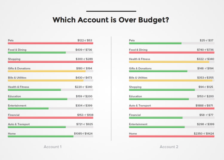
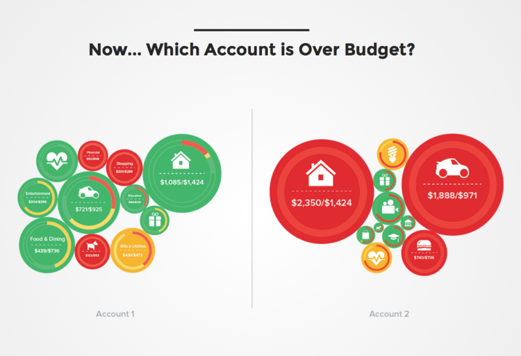
As an example, both graphics below show exactly the same categories of spend for each user. However, they are presented in two completely different ways. The first one is presented in a way traditional PFM providers have presented information. If you glance quickly, it is impossible to tell how well these users are doing overall for the month. If users want to understand how they are doing, they have to do work.

With the second example on the other hand, you can tell instantly how the user is doing for the month.

These are the types of UI re-imagination that are going to have to take place if digital money management is going to take off.
In conclusion, by looking at the characteristics of traditional PFM you can see why it didn’t succeed. Those products are part of a bygone era. Users expect something simpler, more substantial, and more engaging. Welcome to the world of digital money management (DMM), which is outlined in detail in our Slideshare below.
April 28, 2026 | 3 min read
Feb 9, 2026 | 2 min read
Jan 15, 2026 | 4 min read
